01 / Discover
Every great idea begins somewhere.
We uncover what makes your brand different, meaningful, and impossible to ignore.
The terracotta studio ring floats between the first registration marks.
Independent creative studio
An independent creative studio building distinctive identities, intuitive interfaces, and memorable digital experiences.

01 / Discover
We uncover what makes your brand different, meaningful, and impossible to ignore.
The terracotta studio ring floats between the first registration marks.
02 / Define
We turn insights into a distinctive strategy, positioning, and creative foundation.
A construction grid, measured axes and control points resolve the ring into a solid master mark.
03 / Design
We craft memorable visual languages that connect personality, purpose, and form.
The mark sits on a tilted identity proof with the SELROTI wordmark, a type specimen and three ink swatches.
04 / Experience
We translate identity into intuitive digital experiences that people remember.
Explore SELROTI Editions ↗A fictional SELROTI Editions storefront uses the signature in its masthead and presents the Circular Studies art book.
05 / Evolve
We refine, improve, and evolve experiences as brands grow.
The edition folds back into the original SELROTI ring.
03 / Selected Work
A selection of identities, interfaces, and digital experiences shaped by curiosity, strategy, and a belief in remarkable design.
A quieter daily ritual.
01 / Concept Project
A new language of wellness.
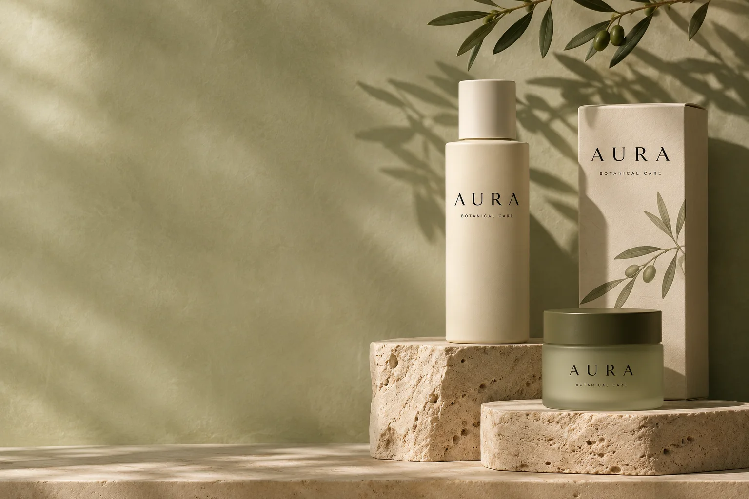
A botanical care identity expressed through spaced serif letters, olive glass, and uncoated paper.
Brand Identity / Art Direction / Digital Experience
Explore AURA ↗AURA / Design study
The packaging sets the pace for the shop. The same generous margins and fine lettering frame each daily ritual.
 01 / Residential
02 / Concept Project
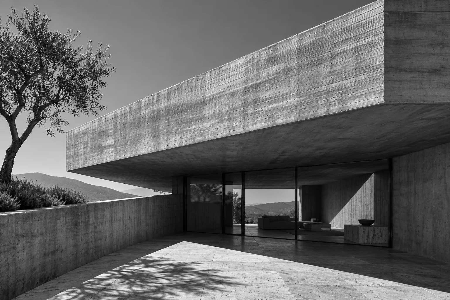
Architecture in digital form.
A digital publication for an architecture practice, pairing quiet project indexes with photographs at architectural scale.
Website Design / UI/UX / Creative Development
Explore FORM ↗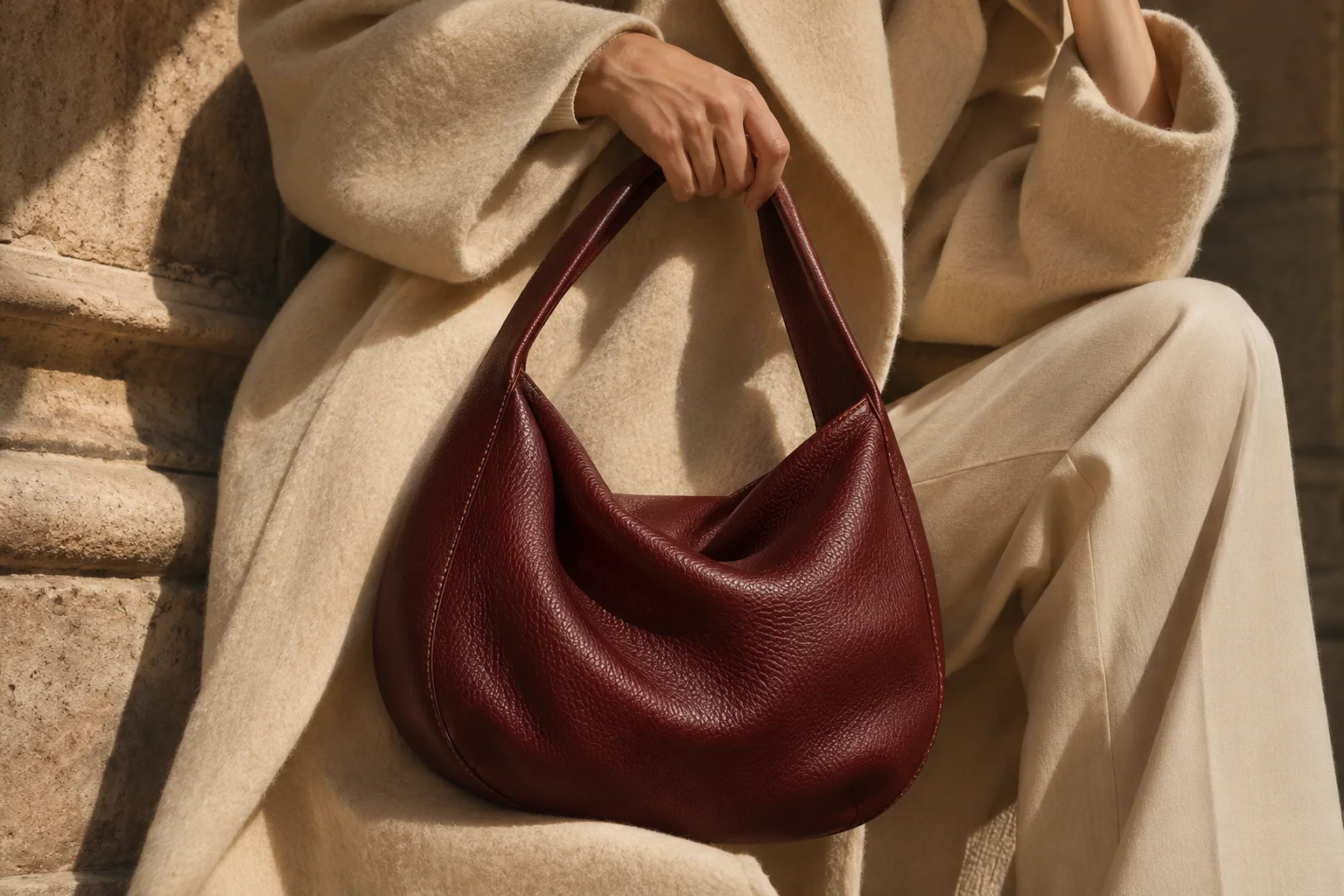
03 / Concept Project
Commerce with character.
A leather goods storefront that moves from the gesture of carrying a bag to the detail of its grain.
E-Commerce / Digital Product / Brand Experience
Explore KIN ↗KIN / Commerce prototype
An on-body view establishes scale. A closer crop reveals the leather, while colour and the bag action stay together on the mobile product page.
04 / The Transformation
Good design isn't just about how something looks. It's about how clearly it communicates, how naturally it works, and how confidently it represents your brand.
STILL / Curated Stays Fictional concept
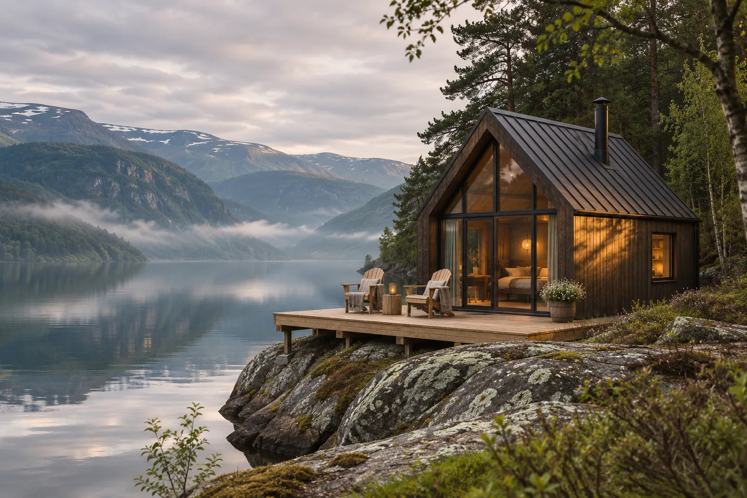
Both STILL concepts introduce Fjord House in Hardanger, Norway, with “Find your place to slow down” and an Explore Stays action. Before places the cabin in a listing beneath a standard banner. After pairs an editorial introduction and forest-green masthead with a large photograph, labelled with the destination and capacity for two guests.
Drag to explore the difference. Use the arrow keys to adjust, Home for After, or End for Before. You can also select Before or After.
01 / Brand clarity
A distinctive identity replaces generic visual language, making the brand easier to recognize and remember.
02 / User experience
Clearer navigation and content hierarchy help visitors understand what matters and where to go next.
03 / Visual communication
Typography, imagery, and spacing work together to create a cohesive and intuitive experience.